
News
12 Car Park Signage Examples for Safer Sites

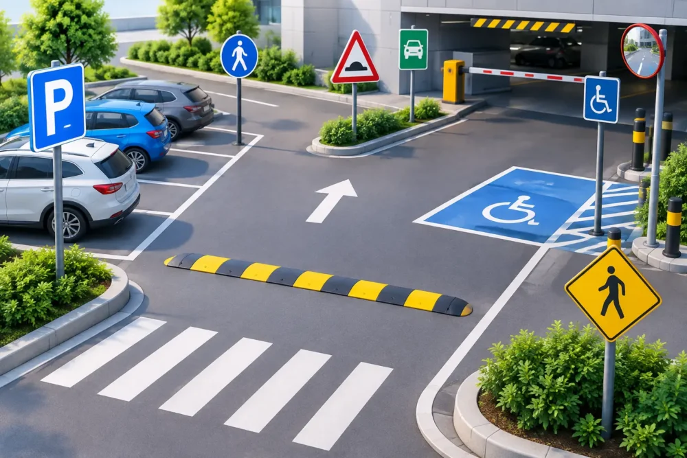
A poorly marked car park creates avoidable problems: drivers enter through the wrong gate, visitors park in operational areas, and pedestrians cross vehicle routes without clear guidance. These car park signage examples show how businesses, contractors and site managers can make access safer, clearer and easier to manage while keeping a professional appearance.
The right sign depends on the site. A small office car park may only need a few clear rigid boards, while a construction compound, retail park or event venue may need banners, directional signs and safety messages across several access points. The common requirement is simple: signs must be easy to see, quick to understand and made for the conditions they will face.
12 practical car park signage examples
1. Entrance and exit signs
Clearly marked entrance and exit signs are the starting point for any organised car park. They reduce hesitation at gates, prevent vehicles using the wrong lane and help maintain a steady flow of traffic at busy times.
For permanent locations, Dibond or other rigid aluminium composite boards offer a clean, durable finish. For temporary compounds, a PVC banner fixed to fencing or gates is a cost-effective option that can be produced at the size needed for good visibility.
2. One-way system signs
One-way routes are particularly useful where space is limited, visibility is poor or delivery vehicles share the site with staff and visitors. Large arrows, a short instruction and strong contrast are more effective than a sign packed with wording.
Place these signs before the driver reaches the decision point, not beside it. A one-way arrow positioned halfway through a tight turn is often too late to be useful. Repeating the message along a longer route can also reduce accidental wrong-way movements.
3. Visitor parking signs
Visitor bays should be obvious from the moment a driver enters the site. A sign stating “Visitor Parking” with a directional arrow gives people confidence that they are in the right place, while helping protect staff, fleet and reserved bays from casual use.
This is a good example of where a matching set of signs improves the whole site. Use the same colours, typefaces and layout on entrance boards, directional signs and bay markers so visitors can follow the route without having to stop and interpret each sign from scratch.
4. Staff-only and permit-holder signs
Allocated parking only works if the restriction is visible and unambiguous. “Staff Parking Only”, “Permit Holders Only” or “Authorised Vehicles Only” signs help manage capacity, especially at workplaces, depots and shared business premises.
Where enforcement is in place, include the relevant instruction or terms clearly, but do not make the main message difficult to read. The restriction should be the largest element. Fine print can support it, but it should never be the only information a driver sees.
5. Accessible parking bay signs
Accessible spaces need clear identification at the bay and on the approach route. A visible sign reduces misuse and helps visitors locate suitable parking without having to search around the site.
Positioning matters here. Mount a rigid sign at a height that is visible over parked vehicles, and consider adding ground markings where appropriate. On larger sites, include accessible parking on a welcome board or site map near the entrance.
6. Electric vehicle charging signs
As more workplaces, retail sites and venues install charging points, clear EV bay signage is becoming essential. Signs can indicate whether bays are for charging only, whether time limits apply and who is permitted to use the facilities.
A rigid board is usually best close to the charger, particularly where the message will remain in place long term. If rules are likely to change, such as during a phased installation, a replaceable panel or temporary banner can offer more flexibility.
7. Delivery and service vehicle signs
Deliveries can quickly disrupt a car park when drivers have no clear route or unloading point. “Deliveries This Way”, “Goods In”, “No Delivery Access” and “Keep Clear for Lorries” signs direct vehicles where they need to go before they block customer or staff areas.
For construction sites and industrial premises, larger format signs are often worth the extra investment. A lorry driver needs to read the instruction from further away than someone walking through a car park. Fence banners, hoarding panels and large site boards make these routes far clearer.
8. Pedestrian crossing and walkway signs
Vehicle and pedestrian segregation is one of the most important safety considerations on busy sites. Signs for pedestrian crossings, designated walkways and “Look Both Ways” points make people more aware of moving traffic and reinforce marked routes.
These messages should be concise and placed where the risk occurs. A sign at the entrance alone will not protect a crossing near a loading area. Use highly visible colour combinations and repeat key warnings where pedestrians and vehicles meet.
9. Speed limit signs
A speed limit sign gives drivers a clear expectation as soon as they enter private land. Common limits on commercial and construction sites include 5 mph and 10 mph, depending on the layout, pedestrian activity and vehicle movements.
Make the number large enough to read from a moving vehicle. Add a short supporting message such as “Pedestrians on Site” if that reflects the risk, but avoid overloading the design. The speed limit needs to remain the focal point.
10. Keep clear signs
Keep clear messages are valuable around emergency access, loading doors, fire exits, barriers and turning circles. They help preserve the space needed for safe operations and prevent parking from creating a bottleneck.
Rigid signs work well where the restriction is permanent. For temporary works, event setups or changing delivery arrangements, printed correx boards or PVC banners can be a practical, lower-cost choice. The material should suit the duration and exposure of the job, rather than simply being the cheapest option.
11. Height restriction signs
Height restriction signage is essential wherever there are barriers, canopies, low beams or covered parking areas. It protects buildings, vehicles and equipment by giving drivers a clear warning before they commit to a route.
Display the maximum height at the approach as well as at the barrier itself. A driver who only sees the sign at the point of entry may have nowhere safe to turn around. For busy service yards, an additional advance warning can save time and avoid damage.
12. Temporary event parking signs
Festivals, open days, trade events and seasonal promotions often need temporary parking instructions that can be installed quickly and removed afterwards. Directional banners, flags and correx signs can direct visitors to overflow parking, disabled access, registration areas and exits.
Temporary does not mean low visibility. Use large text, bold arrows and straightforward instructions. If the public is unfamiliar with the location, place the first sign before the turn rather than directly at it. This reduces sudden braking and keeps traffic moving.
Choosing the right material for car park signs
The best material is driven by location, lifespan and viewing distance. For a permanent exterior sign, Dibond is a popular choice because it is rigid, professional and suited to year-round use. Foamex can be effective for sheltered areas or shorter-term indoor and outdoor applications, while correx is a practical option for temporary notices.
PVC banners are ideal when the message needs to cover a gate, fence or large open space. They deliver excellent visibility at a competitive price and can be fitted with eyelets for straightforward installation. On exposed fencing, mesh banners allow wind to pass through, making them a sensible choice for larger graphics.
For sites with frequent changes, do not commit every message to a permanent board. A mix of long-term rigid signs and flexible temporary banners is often more cost-effective. It lets you keep core safety and directional information in place while updating visitor, contractor or event messaging as needed.
What makes car park signage work
Effective car park signage is not just about printing the right words. It is about placing the right message where a driver, pedestrian or delivery operative needs it. Check sightlines from inside a vehicle, account for parked cars that may obscure low-level signs, and make sure arrows point in the exact direction of travel.
Keep designs uncluttered. High-contrast colours, large type and simple symbols are easier to understand at a glance. Where there are several messages on one board, establish a clear order: the main instruction first, the direction second, supporting information last.
For construction and operational sites, consider how signs will cope with mud, weather, vehicle movements and changing layouts. Printed signage needs to be durable, but it also needs to be easy to replace when the site plan changes. Big Value Banners can produce custom-sized boards, banners and site signage with free design support and fast dispatch, helping buyers source practical car park signage without unnecessary delays.
A well-signed car park makes the first few minutes on site simpler for everyone. Start with the decisions that cause the most confusion, make those messages impossible to miss, then build outward with signage that supports safe and efficient movement.


