News
How to Design Heras Banners for Busy Sites

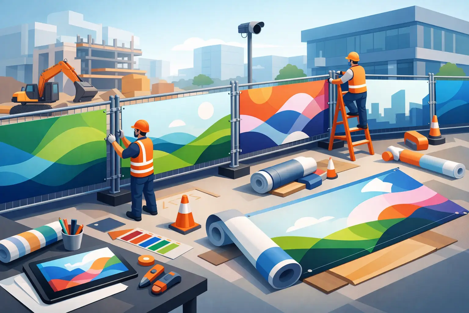
A Heras fence is valuable advertising space, but only if people can understand the message as they walk, drive or queue past it. Knowing how to design heras banners means balancing branding with site conditions: the banner must look professional, remain readable at distance and stand up to wind, rain and day-to-day activity.
For construction sites, development projects, events and temporary compounds, the best designs are rarely the busiest. A clear logo, a strong message and the right print material will usually outperform a banner crammed with small text, multiple images and too many calls to action. The fence line may be long, but every panel should earn its place.
Start with the job your Heras banner needs to do
Before creating artwork, decide what the banner is there to achieve. This affects the wording, layout, material and number of banners required. A site boundary used to promote a housing development needs a different approach from one used to display contractor branding, safety information or event sponsorship.
For branding, keep the company name and logo prominent, then support them with one memorable line such as a service, project name or key benefit. For a development, consider adding the developer name, a CGI or location message, provided the visual remains clear from the pavement or road. For events, dates, directional information and sponsor logos may matter more.
A single banner can carry one focused message. Across a longer run of fencing, repeat the core brand identity while varying selected panels with supporting messages. This creates a more considered site perimeter without making every banner compete for attention.
How to design Heras banners for quick reading
People do not stop in front of most fencing banners to study them. They see them while moving. Design for a few seconds of attention, not a brochure-length read.
Put the most important message first
Your logo, project name or main promotional statement should be the largest element. Place it where it will not be hidden by fence clips, folds or overlapping edges. A strong visual hierarchy is simple: first the brand, then the main message, then only the essential contact or supporting details.
Avoid making every element large. If everything demands attention, nothing does. Give the main message room to breathe with clear space around it, especially when using a busy image or coloured background.
Use large type and short copy
Small lettering disappears outdoors. Website addresses, phone numbers and social media details are useful only when they can be read. Use a clear, bold typeface with enough contrast against the background, and keep the message short.
As a practical rule, choose one headline rather than a paragraph. “New homes coming soon”, “Building Britain”, “Site entrance” or “Proud project partner” are far more effective than a full description of your business. If you need to provide more information, direct viewers to a short web address or use a QR code as a secondary feature, not the sole route to action.
Make contrast do the hard work
Dark text on a pale background or pale text on a dark background is generally easiest to read. Brand colours should lead the design, but not at the expense of visibility. A pale logo on a pale photograph, for example, may look acceptable on screen yet become difficult to see in bright daylight.
If using photography, apply a solid colour panel, tint or fade behind text. This gives the copy a consistent background and keeps the design readable even when lighting changes. UV printing delivers strong full-colour results, but good artwork remains the starting point for a banner that works outside.
Choose the right size, layout and material
Standard Heras panels are commonly around 3.5 metres wide by 2 metres high, but site fencing and fixing arrangements can vary. Measure the usable area before ordering, including any gates, uneven ground, braces or sections where access is needed. A custom-sized banner can be the better option where a standard format would leave awkward gaps or obscure important site features.
Design each banner as a complete panel first. If artwork is intended to run across several banners, allow for the joins between fence sections. Text, faces and logos should not sit across a seam, as slight movement or alignment differences can split the image and weaken the result.
Mesh banners are often the practical choice for exposed sites. The perforated material allows wind to pass through, reducing pressure on the fencing while still carrying vibrant printed graphics. This makes mesh particularly suitable for long fence runs, open developments and locations prone to gusts.
PVC banners provide a solid, high-impact finish and can be a good fit for more sheltered areas, internal compounds or short-term promotional use. The trade-off is wind loading. Large solid banners on exposed Heras fencing need suitable fixing and sensible placement. It depends on the site, the duration of the installation and local conditions.
Build artwork that prints cleanly
A professional print result starts with the correct artwork file. Supply logos as vector files where possible, such as PDF, AI or EPS, so they remain sharp at large sizes. High-resolution photographs are also essential. An image that looks fine on a phone can appear soft or pixelated once printed across a full fence panel.
Set artwork to the final banner size and include bleed where requested. Keep important content away from the outer edges, eyelets and hems. This safe area is particularly important for logos, telephone numbers and QR codes. A fence banner is a finished physical product, not just a flat digital graphic.
Use CMYK colour settings when preparing files for print. Screen colours are produced with light, whereas printed colours are created with ink, so there can be some variation between a bright on-screen shade and the finished banner. If accurate corporate colours are critical, tell your print supplier at the proof stage and provide brand references where available.
Check every line of text before approval. Spelling errors, outdated contact details and old project dates are costly to spot after installation. A free artwork proof gives you the chance to inspect sizing, positioning and content before production, so share it with the person responsible for brand approval as well as the site team.
Plan for installation, not just appearance
The strongest design can still look poor if it is fitted badly. Make sure eyelets are specified at suitable intervals and use secure banner ties designed for outdoor use. Fix the banner evenly around the panel, working from the top corners and keeping the material under controlled tension. Do not pull it so tight that the eyelets strain, but avoid loose areas that flap or sag.
Consider the view from both directions. A banner facing a road may need a different message from one facing a pedestrian route or site entrance. Keep emergency access points, safety notices and visibility splays clear. Promotional fencing should support safe site operation, never interfere with it.
For longer-term projects, inspect banners during routine site checks. Replace damaged ties, remove grime where practical and look for tears around fixing points. Weather, vehicle movements and repeated gate use all take their toll. Ordering a small number of spare banners can save time when a panel needs replacing quickly.
Common design mistakes that reduce impact
The most common mistake is treating a Heras banner like a leaflet. Too much copy, too many logos and too many competing colours make it difficult to read. A simpler layout will look more confident and deliver the message faster.
Another issue is designing from a desktop view alone. Zoom out until the artwork is small on screen. Can you still identify the brand and main statement? If not, simplify it. It also helps to print a reduced-scale version and view it from several metres away.
Finally, do not assume one material suits every job. A solid PVC banner may give the strongest block of colour, while mesh can be the safer, more practical choice on a windy perimeter. The right decision protects both the presentation of the site and the fencing itself.
A well-designed Heras banner turns temporary fencing into a visible, hard-working part of your project. With clear artwork, appropriate materials and a properly checked proof, you can create a site boundary that promotes your brand from the first day on site to the final handover.


