News
Best Temporary Directional Signs for UK Sites

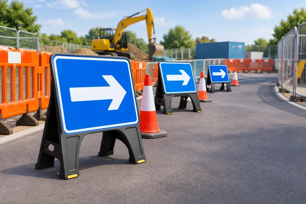
A delivery driver should not have to guess which gate is live. A visitor should not need to stop at every junction to find reception. The best temporary directional signs make routes obvious at the point a decision is needed, whether that is on a construction site, at a retail promotion, around an exhibition or during a one-off event.
For UK businesses, temporary does not have to mean flimsy. The right sign needs to stay readable in changeable weather, fit the available fixing points and be quick to replace when a site layout changes. Choosing well keeps traffic moving, reduces avoidable interruptions and gives visitors confidence that the operation is organised.
What makes the best temporary directional signs?
The best temporary directional signs are not simply the largest boards with the boldest arrows. They are signs selected for the environment, viewing distance and length of use. A direction to a site office on a pedestrian route has different requirements from a lorry route sign at a busy construction entrance.
Start with the route itself. Identify every point where a person, vehicle or supplier can take a wrong turn. Then make sure the sign gives one clear instruction: left for reception, right for deliveries, straight on for parking. Trying to combine too many messages on one panel is where otherwise good signage fails.
Readability matters more than decorative design. Use a strong contrast between the background and lettering, large arrows, short wording and a layout that can be understood in seconds. Company colours can still be included, but they should support the message rather than compete with it. For active sites, keep safety and operational instructions prominent and avoid placing branded graphics where they reduce clarity.
Durability is equally practical. Wind, rain, dust, footfall and repeated handling soon expose poor material choices. A sign that curls, fades or comes loose creates the same problem as no sign at all.
Choose the right format for the location
There is no single best material for every temporary route. The right choice depends on where the sign will be installed, how long it will remain in place and whether it needs to be moved regularly.
PVC banners for fences, gates and wide routes
PVC banners are a cost-effective option for clear, large-scale instructions. They work particularly well on Heras fencing, gates, hoardings and perimeter barriers, where there is enough width for an arrow, destination and site branding. A banner can direct vehicles towards an entrance, separate trade and public access, or mark a compound exit without requiring a permanent structure.
For exposed fencing, mesh banners are often the better option. The perforated material allows wind to pass through, reducing pressure on the fence while retaining a full-colour printed message. This makes mesh a sensible choice for long runs of temporary fencing and open construction locations. Standard PVC offers a more solid appearance and stronger colour impact, so it is often preferred where wind exposure is lower or a panel needs to be seen from further away.
Rigid boards for close-up instructions
Foamex boards and Dibond signs suit locations where a crisp, stable panel is needed. Use them for site offices, reception points, pedestrian routes, welfare areas, car parks and internal access instructions. Rigid boards are easy to read at close range and can be fixed to walls, posts, fencing or temporary frames.
Foamex is a practical, value-led choice for short-term indoor and sheltered outdoor use. Dibond is a stronger option for longer outdoor use, high-traffic locations and situations where a more substantial finish is required. If the sign will be repeatedly handled, mounted at a busy entrance or kept in place through several project phases, spending a little more on a durable board can prevent replacement costs later.
Self-adhesive vinyl for temporary surfaces
Vinyl graphics are useful when the message needs to sit directly on a smooth surface. They can be applied to windows, site cabins, doors, counters, display walls and temporary partitioning. A large arrow on a glazed entrance, for example, can direct visitors towards a registration desk without adding another freestanding sign.
Check the surface before ordering. Vinyl needs a clean, smooth application area, and suitability varies between internal walls, painted surfaces, glass and textured panels. It is a neat solution, but it is not the answer for every outdoor or uneven location.
Roller banners for events and changing interiors
For exhibitions, open days, conferences and sales spaces, roller banners offer a quick way to guide people through a temporary layout. They are portable, self-supporting and simple to reposition as queues or stand layouts change. A roller banner is ideal for directions such as registration, demonstrations, collection points or meeting rooms.
They are best used indoors or in sheltered conditions. Outdoor wind and uneven ground can make freestanding displays unsuitable, so choose fence banners or fixed boards where stability is the priority.
Design for a decision, not a brochure
A directional sign should answer a simple question: where do I go next? That means each panel needs a hierarchy. The arrow should be immediately visible, followed by the destination, then any secondary information such as a gate number or company logo.
Use familiar wording. “Deliveries”, “Visitor Parking”, “Site Office”, “Pedestrian Entrance” and “Exit” are faster to understand than long-form instructions. If a route is for a specific group, say so clearly. “Contractor Entrance” and “Public Entrance” reduce confusion more effectively than a general arrow alone.
Text size must match viewing distance. A sign read from a vehicle needs much larger lettering than one beside a reception desk. Consider approach speed too. Drivers need earlier warning and fewer words, while pedestrians can take in more detail at close range.
Where a route includes several turns, repeat the same visual language. Use the same arrow style, colour coding and destination name from the first sign through to the final point. Consistency reassures people that they are still following the correct route. It also makes updates easier when site conditions change.
Place signs where people actually hesitate
Good temporary signs are positioned before the decision point, not after it. At a construction entrance, that may mean placing a delivery instruction before the gate rather than on it, giving drivers room to slow down and turn safely. At an event, it may mean putting the first direction at the entrance and another at every corridor split.
Avoid hiding instructions behind parked vehicles, open gates, skip lorries, foliage or stacked materials. On live sites, visibility can change daily, so a quick inspection is worthwhile after deliveries, weather events or layout changes. A sign that was clear on Monday may be blocked by Thursday.
Mounting also matters. Fence banners should be tensioned securely with suitable fixings so they do not sag or flap excessively. Boards need fixing points that keep them flat and at a sensible reading height. For temporary sites, do not place critical instructions where they can be removed, turned around or damaged by normal operations.
Plan for change without wasting print
Temporary directional signage often changes because access routes, gate positions, parking arrangements and work phases change. Instead of printing one large panel with every detail, separate permanent information from variable information where possible. A general branded entrance banner can remain in place while smaller boards identify the current delivery gate or visitor route.
This approach reduces waste and makes updates faster. It is also useful for event organisers who run the same venue with different layouts. Reusable roller banners or generic route markers can be paired with new printed boards for date-specific instructions.
Before sending artwork to print, check the destination names with the people managing the site. Confirm arrows against the actual route, not a plan that may be out of date. Include contact details only where they genuinely help, such as a delivery number at an unmanned gate. A phone number should never replace a clear direction.
Order signs that work as a set
The strongest results usually come from ordering a coordinated group of signs rather than reacting to each problem separately. A site may need a gate banner, pedestrian direction boards, parking signs, site office graphics and safety messaging at the same time. Matching sizes, colours and wording creates a more professional impression and makes the route easier to follow.
At Big Value Banners, custom sizes, full-colour UV printing and free design support make it easier to build signage around the actual site rather than forcing a standard format into the wrong space. A proof is the opportunity to check arrows, wording, dimensions and fixing requirements before production begins.
Temporary wayfinding should be reviewed as often as the environment changes. When every arrow is clear, every sign is visible and every route has a purpose, visitors spend less time asking where to go and more time getting on with the job.


